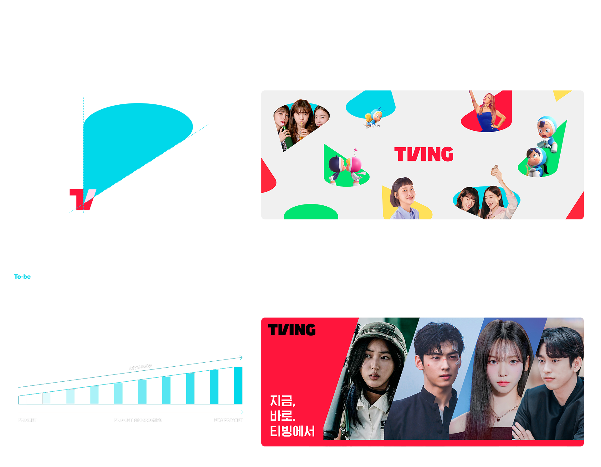
급변하는 OTT 시장과 글로벌 확장성을 고려하여 티빙의 시각 시스템을 리브랜딩했습니다. 매체와 디바이스의 제약 없이 일관된 브랜드 인상을 전달하기 위해 코어 자산을 정교화하고, 디지털 환경에 최적화된 운영 원칙을 수립했습니다.
I rebranded TVING’s visual system to address the rapidly evolving OTT market and global scalability. To ensure a consistent brand impression across all media and devices, I refined core assets and established operational principles optimized for the digital environment.
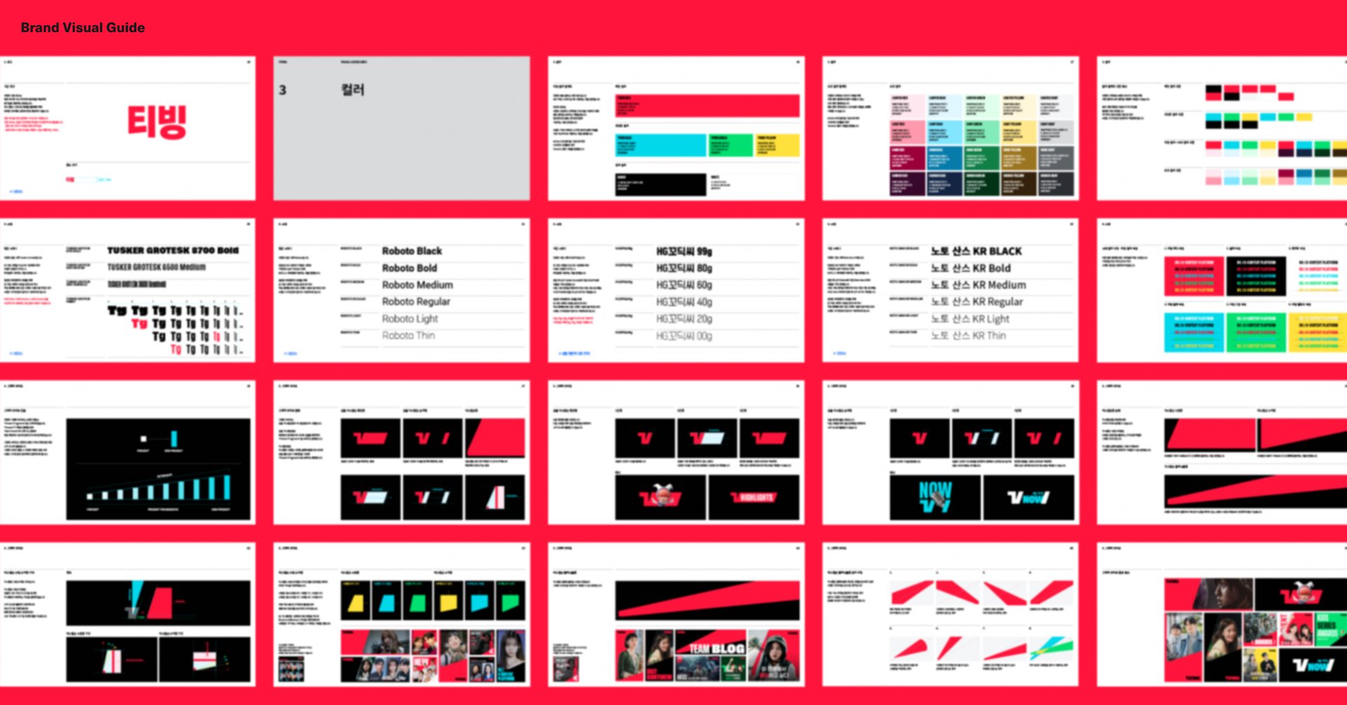
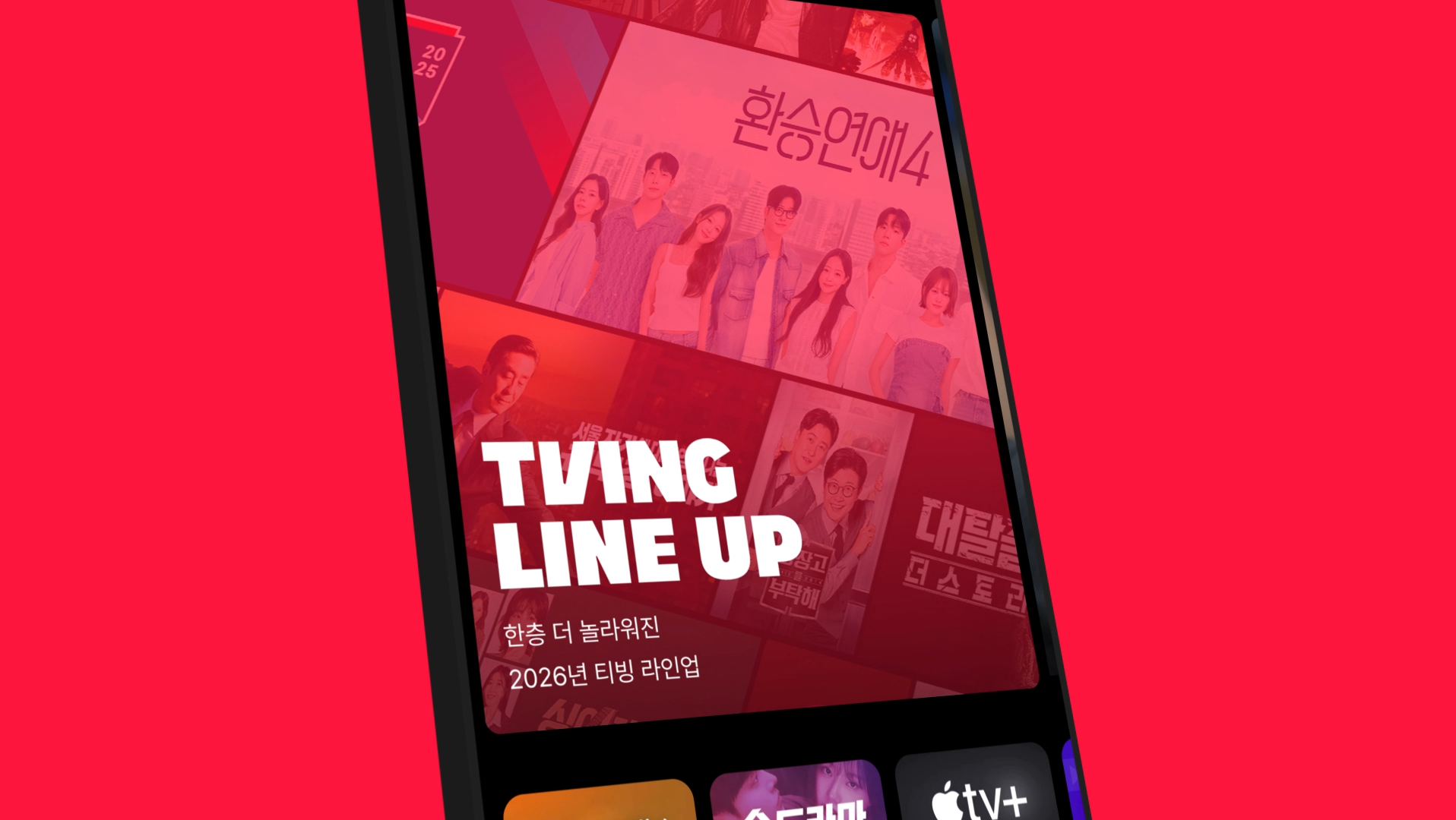
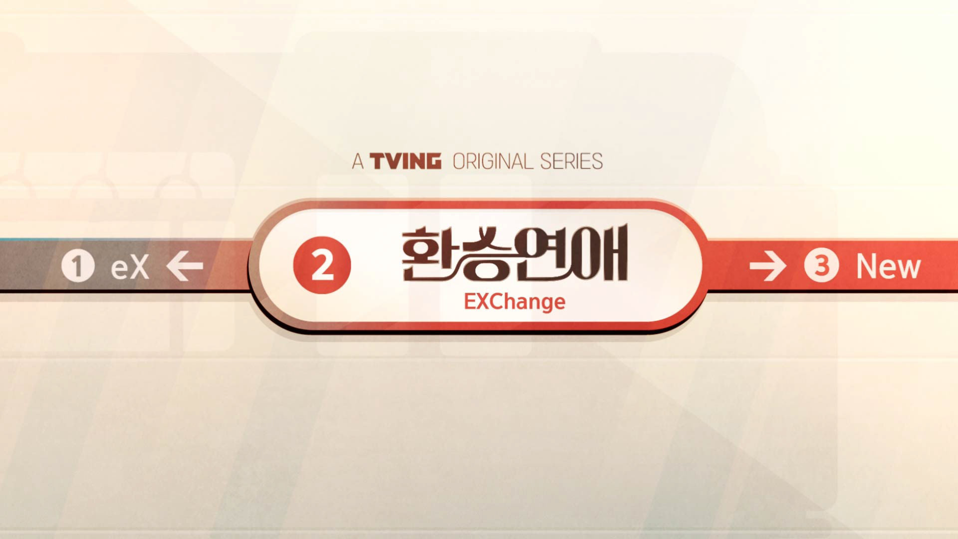
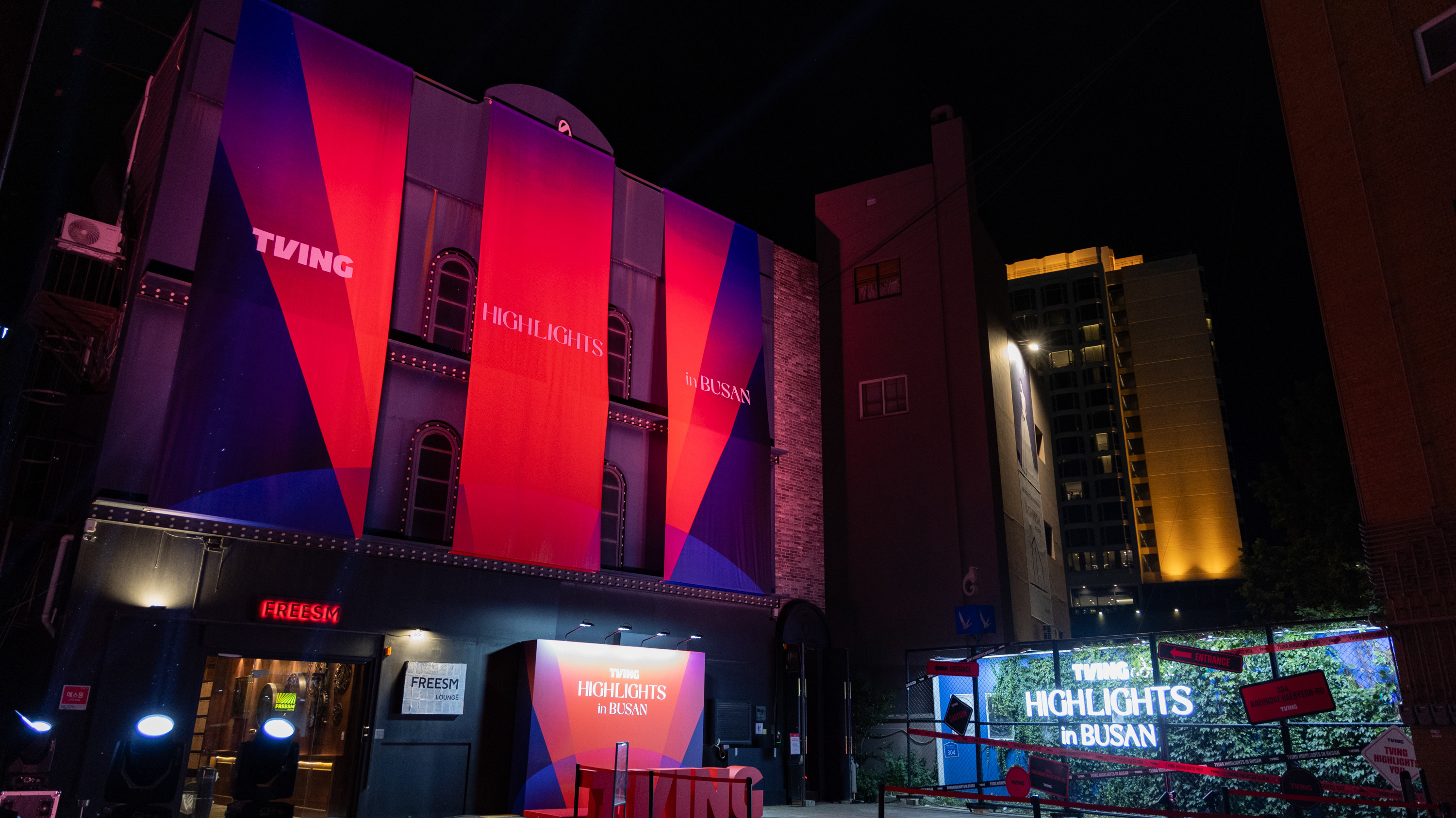
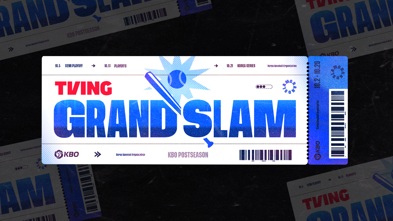
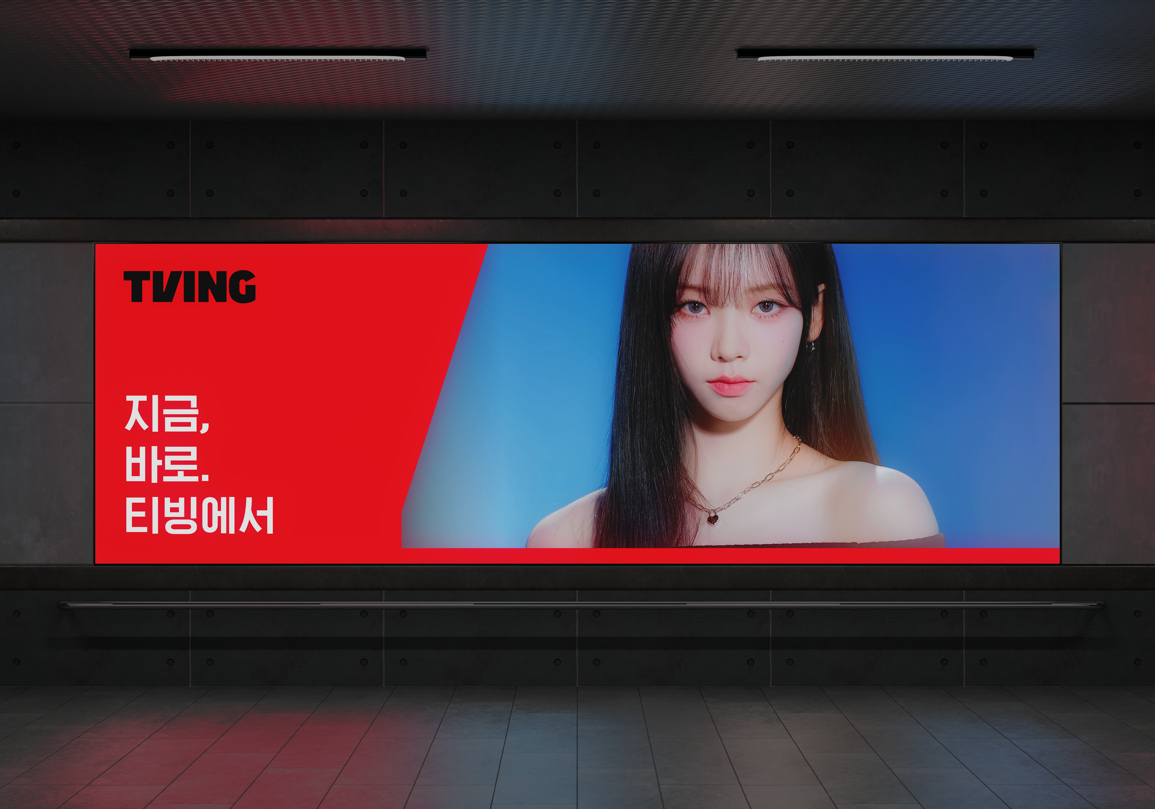
플랫폼의 일관성을 유지하기 위한 코어 시스템가이드 입니다. 디지털 환경에 최적화된 컬러팔레트로 다시 정비하였고 특히 다크모드 환경을 고려한 배색 시스템을 정립하였습니다. 정보 위계를 위한 국/영문 타이포 시스템 확립 및 브랜드 보이스를 일관되게 전달하기 위한 그래픽 톤앤매너 원칙을 수립하였습니다.
This is the core system guide designed to ensure platform consistency. I redefined the color palette for digital optimization, specifically establishing a color system tailored for Dark Mode. I also established a Korean/English typography hierarchy for clear information architecture and defined graphic tone-and-manner principles to deliver a consistent brand voice.
TVING Visual Guide Renewal
Role : Identification, Graphic Motif Design
2023. 3
From Brand team, TVING